Full filmOpen on Vimeo
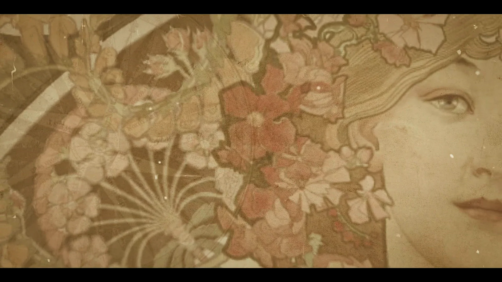
Artist trailer study
Mucha
A reference-led motion study where Art Nouveau color, ornament, and montage translate Mucha into screen rhythm.
Work notes
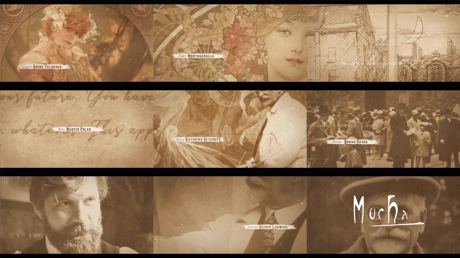
A documentary title sequence that translates Mucha’s work through archival imagery, period typography, warm color, and montage.
Context
The project starts from Alfons Mucha and Art Nouveau references, but the page foregrounds visual translation rather than biography.
Approach
Warm vintage color, retro typography, slow rhythm, montage, and layered narration carry the historical material into video form.
Output
The resulting title sequence combines visual research, historical reference, and motion translation.
Film
Reference images remain in their original research context and are not presented as Ben Ma's authored artwork.
Mucha
May 2020
Documentary title sequence
Original overview
This documentary title sequence introduces Czech artist Alphonse Mucha through selected works and episodes from his life. Vintage color, archival imagery, and restrained music evoke the European context of his career. It was developed during the three-week course period for MOME 729.
Survey
Source credit unavailable in the archived page
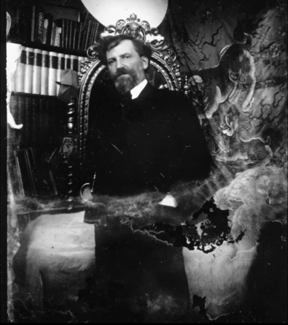
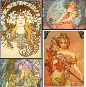
The research began with Mucha's biography and representative works. A Czech painter, illustrator, and graphic artist associated with Art Nouveau, he became known for decorative posters, especially those made for actress Sarah Bernhardt, as well as advertisements, panels, and other designs.
After returning to Bohemia in 1910, Mucha devoted much of the period from 1911 to 1926 to The Slav Epic, a cycle of twenty monumental canvases depicting key episodes in Slavic history.
In 1928, Mucha and Charles Richard Crane presented the completed cycle to the City of Prague as a gift to the nation, marking the tenth anniversary of Czechoslovak independence.
Concept
The title sequence uses warm color, period typography, restrained music, montage, and layered narration to translate the ornamental density and order of Mucha’s work into a slower screen rhythm.
The sequence has two parts: the first presents selected works, and the second introduces Mucha and his creative process. A shift in visual treatment keeps the historical material varied and avoids a repetitive rhythm.
Moodboard
Source credit unavailable in the archived page
At the beginning, I wanted to choose C4D and other 3D modeling software to make this video. For example, modeling objects or abstract objects that are metaphors for people or things that appear in movies.
However, after searching Mucha’s works and style, I think 3D works can not reflect the simplicity and luxurious texture of Mucha’s works.
At the same time, I think this video is intended as the opening title of a documentary, not a science fiction or suspense film.
Therefore, the video needs to show Mucha’s works or images and scenes of that era in Europe, which are not suitable for 3D modeling. So I finally chose to make it in the form of documentary.
Typography
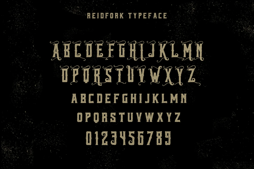
The typography draws on the ornamental linework and period character of Mucha's posters. A decorative serif face, restrained scale, dark lettering, and pale title cards keep the credits legible without competing with the artwork.
Color palette
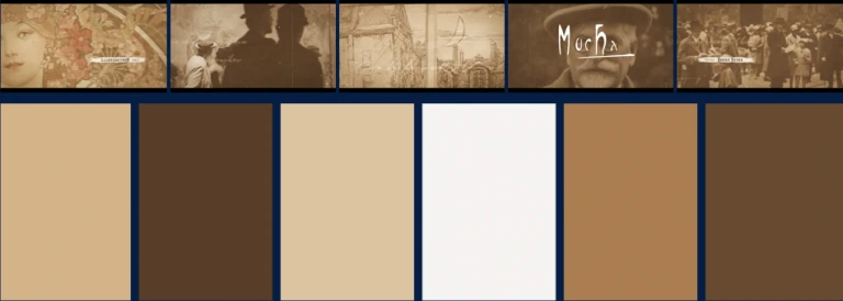
The palette takes cues from the warm yellows and browns visible in the selected Mucha references. I used those tones to unify the sequence and place the archival material within a consistent visual atmosphere.
Final scenes